Dashboard User Guide
Table of Contents
1 Overview
2 Principal Differences
2.1 New Features
2.2 Other differences
2.2.1 Coalescing Alarms and Ticket Ref Propagation
2.2.2 Reports
3 Inline Editing
3.1 Ticket Ref Inline Editing
3.2 Acknowledgement Inline Editing
3.3 Comment Inline Editing
3.4 Confirming / cancelling changes
4 Multiple Alarm Editing
4.1 Row selection
4.2 Ticket Ref Multi Editing
4.3 Clear Time Editing (Single and Multiple)
4.4 Comment Multi Editing
4.5 Acknowledge and Close Multi Editing
5 Pagination (and lazy loading)
5.1 Switching between pages
5.2 Changing the number of alarms shown
6 View Configurations
6.1 Projector
6.2 Desktop
6.3 Laptop
7 Main Menu
7.1 Filters Menu
7.2 Blacklists Menu
7.3 Preferences Button
7.3.1 Theming
7.3.2 Auto Refresh Interval
7.3.3 Acknowledgement Alert Age
7.3.4 Alarms Per Page
8 Context Menu
9 Navigation Bar
10 Info Overlays
10.1 View Alarm Details
10.2 Info Tooltip
10.3 Comment Tooltip
11 Show Origins
11.1 Showing Origins for a given alarm
11.2 Show Origins Page
11.2.1 Juniper Alarm Overlays
11.2.2 Viewing Alarm Ids
11.2.3 Pagination, Filtering and Sorting
12 Smart Dates
13 Quick Filtering
14 Filter and Blacklist Creation
14.1 Creating Filters
14.1.1 Reaching the Create Filter Page
14.1.2 Creating a Filter
14.2 Creating Blacklists
15 Managing Filters
15.1 Filtering Filters
15.2 Deleting Filters
15.3 Running a Filter
15.4 Editing a Filter
16 Managing Blacklists
17 Logging In and Out
17.1 Log In
17.2 Log Out
18 Theme Gallery
Table of Figures
Figure 1 Inline Editing Pencil
Figure 2 An alarm row in edit mode
Figure 3 Masked Ticket Ref Input
Figure 4 Acknowledgment checkbox in edit mode
Figure 5 Comment field in edit mode
Figure 6 Confirm/cancel edit
Figure 7 Multi-edit buttons
Figure 8 Single row selection
Figure 9 Select All Rows
Figure 10 Masked Multi-Edit Ticket Ref Input
Figure 11 Clear Time Multi Edit Calendar
Figure 12 Comment Multi Edit
Figure 13 Acknowledge Multi Edit
Figure 14 Pagination and Alarms Per Page bar
Figure 15 Alarms Per Page Dropdown
Figure 16 Preferences Dialog
Figure 17 Projector View
Figure 18 Desktop View
Figure 19 Laptop View
Figure 20 Main Menu
Figure 21 Filters Menu
Figure 22 Blacklists Menu
Figure 23 Preferences Dialog (from Preferences button)
Figure 24 Theme Dropdown
Figure 25 Auto Refresh Dropdown
Figure 26 Editable Auto Refresh
Figure 27 When On
Figure 28 When Off
Figure 29 Acknowledgement Alert Age Dropdown
Figure 30 Editable Acknowledgement Alert Age
Figure 31 Context Menu
Figure 32 Navigation Bar
Figure 33 Show Details Dialog
Figure 34 Info Tooltip
Figure 35 Comment Tooltip
Figure 36 Show Origins Link
Figure 37 Show Origins Page
Figure 38 Juniper Subtype Overlay Link
Figure 39 Juniper Subtype-specific overlay
Figure 40 Juniper Alarm Properties Button
Figure 41 Juniper Alarm Properties Overlay
Figure 42 Juniper Alarms Ids Hidden
Figure 43 Juniper Alarms Ids Shown
Figure 44 Live filtering
Figure 45 Sort By Icon
Figure 46 Quick Filter from Main Menu
Figure 47 Quick Filter from Context Menu
Figure 48 Quick Filter Dialog
Figure 49 Display after quick filtering
Figure 50 Main Menu Create Filter Link
Figure 51 Context Menu Create Filter Link
Figure 52 Navigation Bar Create Filter Link
Figure 53 Create Filter Page
Figure 54 OR conditional group example
Figure 55 Nested Conditional Group
Figure 56 Doubly nested conditional group
Figure 57 multiple top-level groups
Figure 58 Filter Text
Figure 59 Initial Filter Form
Figure 60 Blank Filter Text
Figure 61 Filter Form with Leaf
Figure 62 Populated Filter Text
Figure 63 Filter text updated with text input
Figure 64 Create Blacklist View
Figure 65 Show Filters
Figure 66 Filtering by filter name
Figure 67 Filter Text When Running Standard Filter
Figure 68 Editing a loaded filter
Figure 69 Show Blacklists page
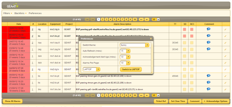
Figure 70: Sunny
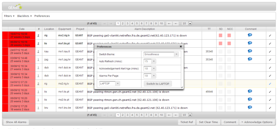
Figure 71 Smoothness
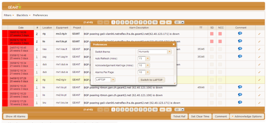
Figure 72 Humanity
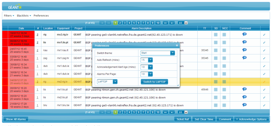
Figure 73 Start
Figure 74 Overcast
Figure 75 Cupertino
Figure 76 UI Lightness
Figure 77 Hot Sneaks
Figure 78 Blitzer
Figure 79 Flick
Figure 80 Bluesky
Figure 81 Redmond
Overview
This user guide is for Dashboard V2, which has been built as a replacement for the existing Dashboard.
The new version of the Dashboard consists of:
- A webapp containing the base functionality (UI, business logic, database interaction/manipulation code)
- 2 web services which coalesce alarms post-correlation and process existing blacklist rules for newly correlated alarms
- A modified correlator to allow for a new database schema
Principal Differences
New Features
Dashboard V2 has a number of features which distinguish it from its predecessor. These include:
- inline editing
- multiple alarm editing
- lazily-loaded, paginated data
- a fully ajaxified front end, with appropriate use of ORM caching to speed up queries
- fully integrated, ajaxified composite filter and blacklist creation views, which allow conditional groups to be recursively nested to varying depths
- editable filters and blacklists (this applies to as yet unsaved as well as saved filters/blacklists)
- multiple view configurations
- theming
- animation alerts for alarms which have not been acknowledged for a configured period of time
- view details dialog instead of show details page
- show origins view broken down into a row-by-row table, with additional dialogs for detail fields
- a quick filter option (1 or more values for a single filter criterion)
- user preferences for:
- theming
- auto refresh time
- unacknowledgement alert age
- alarms per page
- view configuration
- live filtering on individual columns for Show Filters and Show Blacklists views
- live filtering and sorting on columns for Show Origins view
- smart "Outlook-style" dates
Other differences
Coalescing Alarms and Ticket Ref Propagation
There are some differences in coalescing and ticket ref propagation behaviour between new and current dashboards.
Newly correlated alarms in the database will only be grouped with already processed alarms in a single dashboard row if they have the same status as the existing row at the time they are processed by our post-correlation web services. If the statuses are different - if, for example, an active alarm comes in, and the row with which it would otherwise be grouped is clear - a new dashboard alarm will be created and the ticket ref of the existing clear dashboard alarm will be propagated to the new alarm.
In practice, since the alarms are only coalesced once (when new), this means that as well as seeing active and clear alarms on different rows where they would previously have been coalesced, you will also often see more than one "clear" row below (further explanation can be provided if desired).
Reports
Dashboard V2 does not contain Reports functionality, as this is currently unused in its predecessor. However, data analysis features and new style reports are planned for upcoming releases (if desired).
Inline Editing
NCC and SD users have the option of inline editing for 3 fields in the dashboard's main display:
- Ticket ref
- Comment
- Acknowledgement Checkbox (which of the two checkboxes the user can edit will depend on whether they are an NCC or a Service Desk user).
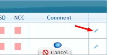
To enable inline editing, click on the pencil icon on the right-hand side of the row to be edited:
Figure 1 Inline Editing Pencil
The editable fields in the row will then switch to an editable format, and the pencil icon will switch to a tick / cross (allowing you to save or cancel the edit when finished):
Figure 2 An alarm row in edit mode
Ticket Ref Inline Editing
When a user clicks on the ticket ref field, a "masked input" appears. This input only allows digits to be entered (0 – 9; min 0, max 5), making it impossible to accidentally enter a ticket ref in an invalid format, and rendering validation redundant.
Figure 3 Masked Ticket Ref Input
Acknowledgement Inline Editing
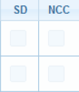
The acknowledgement editor is simply an editable equivalent of the checkbox displayed in standard view mode. To acknowledge/unacknowledge an alarm, simply check or uncheck the checkbox.
Figure 4 Acknowledgment checkbox in edit mode
Comment Inline Editing
The comment inline editor is simply an editable text field. To edit a comment value, write inside the text field.
Figure 5 Comment field in edit mode
Confirming / cancelling changes
To confirm changes made during editing (and have them saved to the underlying database), click on the "tick" icon on the right hand side. To cancel changes, click on the "cross" instead.
Either way, the row will return to the standard, non-editable display.
Figure 6 Confirm/cancel edit
NOTE: in upcoming releases, we may switch to a different form of inline editing which simply requires the user to double click on the value in question and press enter when complete. This is preferable, since it does not require navigation to the right hand side to begin/confirm/cancel editing. On the upside however, with the current view it is at least possible to edit multiple fields when in edit mode, and it's harder to make an erroneous edit (because it needs to be confirmed).
The reason we have not included editing initiated by a double-click in this release is because the underlying view technologies do not currently support it. The next major release of one of the frameworks in question (scheduled for Q2 2013) will allow us to include this feature (if desired).
Multiple Alarm Editing
For those fields where an inline editing option is not available (currently setting clear time only) and those times when a user wants to apply a single edit across multiple rows, there are a series of buttons along the bottom which allow application of an edit to all selected rows:
Figure 7 Multi-edit buttons
Row selection
To select a row in the Dashboard table, check the checkbox on the right-hand side of the row in question:
Figure 8 Single row selection
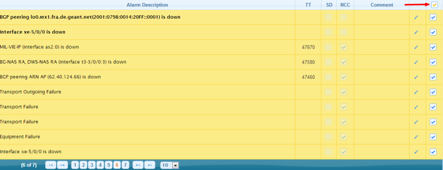
To select all rows on any given page, check the "Select All" box in the top-right:
Figure 9 Select All Rows
Ticket Ref Multi Editing
Clicking on the Ticket Ref button will bring up an overlaid editor component (with an animated slide effect):
Figure 10 Masked Multi-Edit Ticket Ref Input
This has the same masked input described earlier in 3.13.1, ensuring only valid values can be entered. To supply a new ticket ref value for all selected alarms, simply enter a value (0 to 5 digits) and press return. The alarms table above will be updated and the changes persisted to the underlying database.
Clear Time Editing (Single and Multiple)
Since the clear time of a dashboard alarm is not shown in the alarms table, it cannot be inline edited. To set a clear time for one or more alarms, the "Set Clear Time" button should be used.
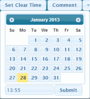
When the clear time button is pressed, an overlaid calendar component will appear:
Figure 11 Clear Time Multi Edit Calendar
The calendar will be initialized by default to the current date and time. If a different clear date is desired, simply select one. Similarly, if a different time is desired, input the new time in the text box below (which has a masked input in the format hh:mm).
Once a date and time have been chosen, click "Submit" to update alarm information and persist the changes to the underlying database.
Comment Multi Editing
Clicking on the Comment button will bring up a text editor. To apply a comment to multiple alarms, simply input a value and press "Submit" (return cannot be used for submission because the comment can be input across multiple lines):
Figure 12 Comment Multi Edit
Acknowledge and Close Multi Editing
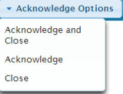
The Acknowledge/Close dropdown allows a user to perform one of 3 operations on multiple alarms:
Figure 13 Acknowledge Multi Edit
Clicking on one of the options will apply its respective operation to all selected alarms.
NOTE: for service desk users, the "Acknowledge Options" dropdown will be replaced with a single "Acknowledge" button, since only NCC users have rights to close alarms.
Pagination (and lazy loading)
In Dashboard V2, only a subset of available alarm data is loaded – on an "as needed" basis - when a user makes a request to show unfiltered or filtered alarms. Typically, this means loading the data to be shown on the page along with "paging" data which allows the application to:
- show the user how many pages will be present in total
- keep track of any pagination information it needs for subsequent user queries
This, in combination with appropriate use of caching, should speed up the user experience considerably. Queries run faster because they are fetching far smaller result sets, and the application runs faster because it has far less data held in memory and has delegated as much of its processing as possible to the database query engine.
Pagination is also "ajaxified" – meaning small chunks of relevant data are sent/received rather than a full request – to speed up the process further and avoid a "page flip" when a user moves between pages.
Switching between pages
There is a pagination bar at the top and bottom of the dashboard alarms table:
Figure 14 Pagination and Alarms Per Page bar
To move between pages, either:
- Click the number of the page you want to move to
- Click the "double arrowed" forward/backward buttons to move to the next/previous page
- Click the "begin/end" buttons to go to the first or last page
As mentioned above, ajaxification of pagination means the data within the table will be altered without going to a new page.
Changing the number of alarms shown
To alter the number of alarms shown on a page, click on the dropdown to the right of the pagination bar:
Figure 15 Alarms Per Page Dropdown
On selection of an option, the table will automatically update to show the requested number of alarms.
NOTE: using this option will update the number of alarms shown on a temporary basis. If the user instead wants to permanently update the number of alarms shown on a page, he/she should do it through the preferences dialog, which will both automatically update the number of alarms shown and save that number as a preference for the logged in user. See 7.3.4 for further information.
h1.View Configurations
Dashboard V2 has 3 view configurations:
- Projector: optimised for 1024 x 768
- Laptop: optimised for 1366 x 768
- Desktop: optimised for 1920 x 1068
A given user can switch view configurations by bringing up the "Preferences" dialog. This can be done via the button on the main menu (if not in Projector view) or the context menu (right click within alarms table).
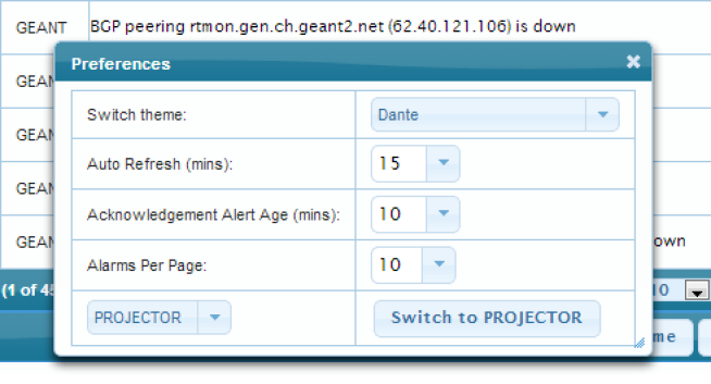
The Preferences dialog looks like this:
Figure 16 Preferences Dialog
When a user changes the value shown in the view dropdown and presses the "Switch to …" button to confirm:
- the display will automatically switch to the selected view
- the preference will be saved for that user's next login
Projector
As the name suggests, this view is intended for a projector display only.
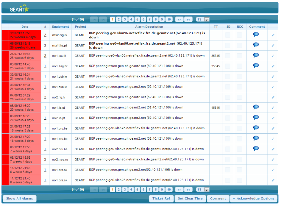
The column widths are much slimmer than the other view configurations and the header containing the logo is significantly smaller than the Desktop view.
As well as being optimised for a lower resolution screen, it also sacrifices some visual components (chiefly the main menu and navigation links) in favour of a less cluttered display.
However, inline and multi-editing features are still available, and all other functionality can be reached via the context menu (right-click).
The projector display is shown below:
Figure 17 Projector View
Desktop
This view is intended for use on a user's normal desktop monitor, provided it's a new style monitor with a high resolution (if using a lower resolution, it may be better to opt for the Laptop configuration).
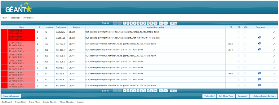
The header occupies a lot more vertical space than the projector and laptop configurations, and the columns have been permitted significantly more width. In addition, the desktop view has a main menu and a set of navigation links along the bottom (alongside the context menu available to all views).
The desktop display is shown below.
Figure 18 Desktop View
Laptop
This view is intended for any PC screen resolution below 1920 x 1080.
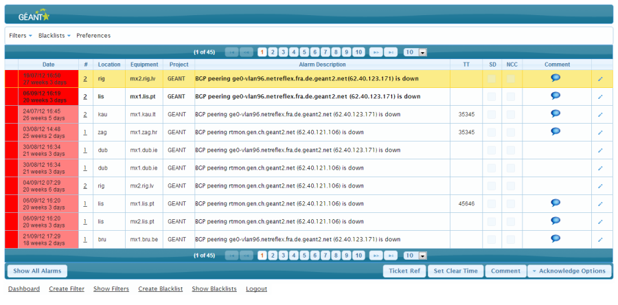
Like the projector view, laptop has a smaller header and logo, but like the desktop view it has the menu bar and navigation links (and the context menu common to all views).
The laptop view is shown below:
Figure 19 Laptop View
Main Menu
The main menu is only available in the Desktop and Laptop configurations (though the same functionality is available for all configurations through the right-click context menu; see 1 for more information).
It looks like this:
Figure 20 Main Menu
Filters Menu
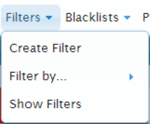
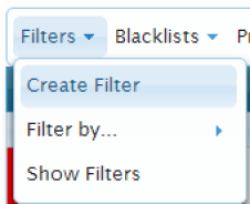
The Filters menu provides 2 navigation options, and one "quick filter" option. When expanded, it looks like the image below:
Figure 21 Filters Menu
Create Filter and Show Filters take the user to the pages of those names. The pages will be discussed in subsequent sections (14.1 and 1).
Filter by… brings up a sublist when selected, allowing the user to filter by a single criterion very quickly by specifying one or more values. This will be explained in the Quick Filter section (1).
Blacklists Menu
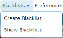
The Blacklists menu simply provides 2 navigation options:
Figure 22 Blacklists Menu
They each go to the page of that name. Both pages will be discussed in subsequent sections (14.2 and 1).
Preferences Button
The Preferences button on the dialog brings up the Preferences menu, which we already touched on briefly during discussion of view configurations. As a reminder, the Preferences menu looks like this:
Figure 23 Preferences Dialog (from Preferences button)
Each of these settings represent preferences for the currently logged-in user which will be stored in the database, and applied whenever that user logs in.
Since we have already discussed view configurations (Section 1), discussion will be limited here to the other 4 preferences.
Theming
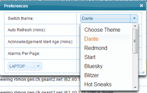
The theme dropdown shows a number of different possible "themes" which can be applied to alter the aesthetics of the dashboard display. Some of these themes have been created by us; others are part of JQuery themeroller, with which the dashboard app is integrated.
The expanded dropdown looks like this:
Figure 24 Theme Dropdown
To select an alternative theme, simply click the relevant option. This will:
- Update the dashboard display to reflect the new theme
- Save the new theme as a preference of the currently logged in user
All users will initially have the "Dante" theme as their default preference. Examples of other themes are included in the theme gallery in Section 1 (all themes are shown in Laptop view).
NOTE: the selected theme will not apply to the "tree" or associated buttons in the create filter/blacklist views. Theming was integrated wherever possible on these pages, but an entirely different view framework and data model had to be used to achieve the desired composite structure and ajaxified updating of components. Unfortunately, the framework cannot be integrated with these themes. The styling for the pages in question was manually created to mimic the main "Dante" theme in appearance. If matching the colours of the tree components to the current theme on these pages is deemed important, we can manually skin them for a subsequent release and update the skin whenever the theme is switched.
Auto Refresh Interval
Altering the value in the auto refresh preference:
- Makes the UI refresh itself at the specified interval
- Saves the interval as a user preference for subsequent logins
Figure 25 Auto Refresh Dropdown
The numeric dropdown is editable, so any integer can be input:
Figure 26 Editable Auto Refresh
Acknowledgement Alert Age
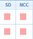
The new dashboard includes an alert if a given alarm has not been acknowledged after a defined period of time. The alert will only be active Mon-Fri 6am-9pm, and takes the form of an animation which toggles the colour of the acknowledgement boxes:
Figure 27 When On
Figure 28 When Off
NOTE: the animation used in Internet Explorer is different: the colour of the checkbox border is toggled, rather than the colour of the box itself. We did this because it's not possible to style the interior of the checkbox attractively in some versions of Internet Explorer.
Defining the Time When Animation Kicks In
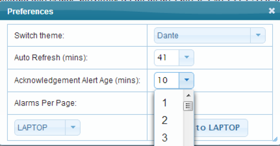
The Acknowledgement Alert Age dropdown in the Preferences dialog can be used to set the required "alarm age"; once this amount of time has passed from the time the associated correlated alarms were input into the dashboard alarms database table, the animation described above will begin.
Figure 29 Acknowledgement Alert Age Dropdown
As with auto refresh, this field is editable:
Figure 30 Editable Acknowledgement Alert Age
Alarms Per Page
This preference was touched on in the pagination section when specifying the alarms per page (section 5.2). As mentioned there, the difference between altering the value here versus in the dropdown on the pagination bar is that here the change is not merely applied immediately, but also saved as a user preference (and so will apply on future logins).
h1.Context Menu
The context menu can be brought up in any of the view configurations by right-clicking on the dashboard alarms table.
It contains all of the functionality described in the main menu above, plus a "Logout" menu item:
Figure 31 Context Menu
Navigation Bar
The footer on all pages of the new Dashboard contains a navigation bar to allow easy access to other pages within the Dashboard:
Figure 32 Navigation Bar
NOTE: The majority of user requests which involve data submission (ie. not "navigation only") are HTTP POST requests (which send their data to the server in the body of the HTTP request, rather than the url). For such requests, the url will often remain the same even if the request involves navigation to a different page. This can make these urls hard to bookmark, and can affect the behavior of the back button in certain situations. For this reason, it is recommended that users use the navigation options in the footer, main menu and context menu in preference to the back button. The state of the previous view they went to will still be maintained by the application where necessary (eg. if a blacklist is being created, and the user wants to test it by running it as a filter, he/she can safely do so, then return to the "Create Blacklist" page without losing the as yet unsaved blacklist; the view would only be cleared when the blacklist is saved or the user manually resets it).
Info Overlays
View Alarm Details
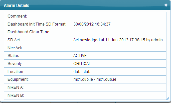
Instead of the show/edit details page reached by clicking on an alarm in the new dashboard, Dashboard V2 contains a view details dialog:
Figure 33 Show Details Dialog
The dialog can be brought up by clicking on or around the alarm description text (as mentioned earlier when discussing row selection in 4.1). As with all overlays in the new dashboard, the alarm details will appear and disappear using JQuery-based effects.
Info Tooltip
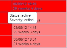
Hovering the mouse over the far left "info" column will bring up a tooltip showing information about:
- The status of the alarm
- Its severity
- Blacklist/whitelist information (if this alarm has been blacklisted/whitelisted)
Figure 34 Info Tooltip
The info column will contain an icon if a blacklist/whitelist applies to this alarm. The icon will be a "down" arrow if the alarm has been blacklisted, an "up" arrow if whitelisted, and an "equals" icon if the alarm has been caught by a blacklist's filter but there has been no change to the alarm's severity (ie. if the blacklist severity matches the original severity).
Comment Tooltip
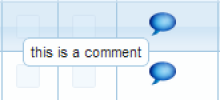
As with the info tooltip above, hovering over a comment icon will bring up a tooltip displaying the comment:
Figure 35 Comment Tooltip
Show Origins
Showing Origins for a given alarm
In Dashboard V2, Show Origins is reached by clicking on the value in the quantity column:
Figure 36 Show Origins Link
This takes the user to the show origins page.
Show Origins Page
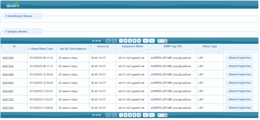
Figure 37 Show Origins Page
The page details data from the traps which made up the dashboard alarm on whose "show origins" link the user clicked.
The information is presented in a row format, rather than in separate tables for each alarm as with the previous dashboard, enabling users to see details for more alarms on screen at any one time.
The "origin" alarms are broken down by type (in the event of multiple contributing types): Juniper, Alcatel, Infinera and E2EMon.
The columns present in each origin alarm table will depend on the type in question: some are common to all alarms; some are unique to the a given type; some are shared across two types etc.
Juniper Alarm Overlays
Juniper Subtype-specific overlay
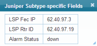
Since Juniper alarms also have several subtypes (BGP, Link, VPN, LSP, Other), subtype specific details are included in an overlay whose fields will depend on the subtype itself. This decision was taken because it was deemed preferable to the alternatives: to have a lot of extra columns (some of which would be redundant since not all will apply to a given alarm), or to go back to the old way of displaying each origin trap a table at a time.
To display the subtype-specific information, click on the id on the left of a given Juniper alarm:
Figure 38 Juniper Subtype Overlay Link
The overlay looks like this:
Figure 39 Juniper Subtype-specific overlay
Juniper Alarm Properties Overlay
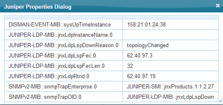
Similarly, some of the more verbose details about Juniper alarms are included in the "Alarm Properties" overlay.
This can be seen by clicking on the "Alarm Properties" button on the right of a given alarm row:
Figure 40 Juniper Alarm Properties Button
The Alarm Properties overlay looks like this:
Figure 41 Juniper Alarm Properties Overlay
Viewing Alarm Ids
To avoid cluttering the display with an abundance of Dashboard and Origin alarm ids, the ids are hidden by default. They can be shown by clicking on the relevant '+' icon:
Figure 42 Juniper Alarms Ids Hidden
Figure 43 Juniper Alarms Ids Shown
Pagination, Filtering and Sorting
Each of the origin alarm tables (Juniper, Alcatel etc) are paginated in a similar way to the main dashboard alarms table (with the same pagination controls).
The user also has the option of filtering and sorting on particular columns within each table. Live sorting/filtering is applied on all origin alarms of that type, not merely the alarms viewable on the page.
Filtering
To filter on a particular column, click inside the text field in the column header and begin to type:
Figure 44 Live filtering
Some fields are filtered by "startsWith", meaning it will only match if the field value begins with the characters you type. However, the longer or more complex text strings (such as a filter string) are filtered by the "contains" match mode instead, meaning you can type any part of the field's value and expect a match.
Live Sorting
To sort by a particular column, click on the "double arrow" icon in the top left hand corner of the column's header cell:
Figure 45 Sort By Icon
The data will then be sorted in ascending or descending order accordingly, and the icon will change to a single arrow pointing up or down (depending on sort order).
Smart Dates
To declutter the dashboard display generally, and to clearly distinguish between alarms which are less than a day old, less than a week old, and more than a week old, smart "Outlook-style" dates have been added to the dashboard date column.
In summary:
- if the earliest trap date for the dashboard alarm in question is within the last 24 hours, only the time will be shown, no date
- if within the last week, the day of the week will be shown (eg "Tuesday") alongside the time
- if more than a week old, the full date will be shown
The "Duration:" prefix indicating a cleared alarm in the old dashboard has also been replaced by the use of italics for the duration value to distinguish cleared duration from active alarm-up time.
h1.Quick Filtering
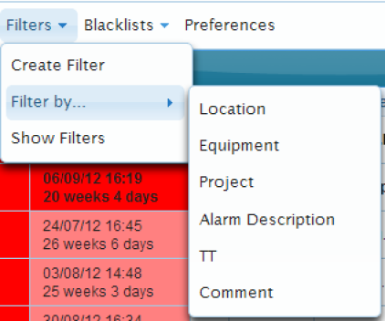
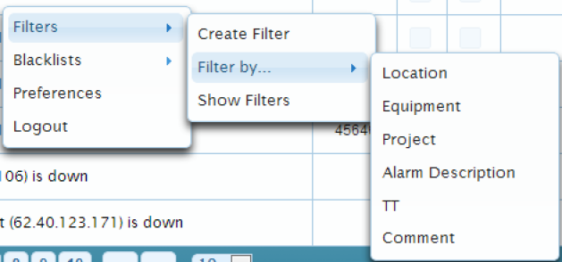
Although there is a separate view for creating complex composite filters (or filters which need to be saved), sometimes it is useful just to be able to run a quick filter on a single criterion. For this reason, a "quick filter" option is available from the "Filters" submenu (in either main or context menu):
Figure 46 Quick Filter from Main Menu
Figure 47 Quick Filter from Context Menu
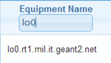
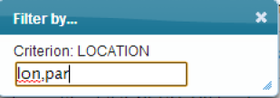
Selecting any one of these criteria will bring up a dialog containing a text box. Into that text box, the user can insert a comma-separated list of values for that criteria:
Figure 48 Quick Filter Dialog
Once the values have been entered, press return, and a filter on those values will be immediately performed (using an OR request; in subsequent releases we can also introduce a quick filter with AND request if desired).
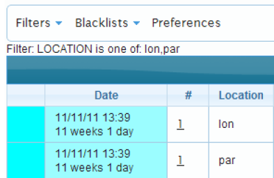
The filter text string will also be visible in the top left of the display below the header:
Figure 49 Display after quick filtering
Filter and Blacklist Creation
Creating Filters
Reaching the Create Filter Page
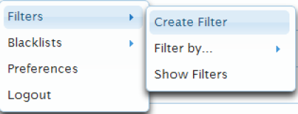
The quick filter feature will only get you so far. If you want to save a filter, create a complex filter or even just filter on more than one criterion, there is a separate filter creation view. To get there, either use the link in the navigation bar, or the menu options in the main or context menus:
Figure 50 Main Menu Create Filter Link
Figure 51 Context Menu Create Filter Link
Figure 52 Navigation Bar Create Filter Link
Creating a Filter
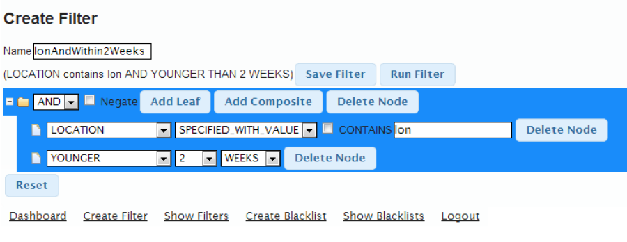
The Create Filter page uses an ajaxified, dynamically updated tree structure to create a filter to be run and/or saved:
Figure 53 Create Filter Page
AND and OR groups
A filter is made up of individual conditions (eg. siteA contains lon) and groups of conditions. Groups of conditions can be nested, so any given conditional group can contain any number of individual conditions or other conditional groups.
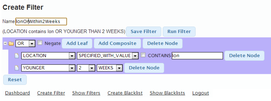
A user can create any kind of composite conditional structure by specifying these conditional groupings as either AND or OR groups. In the case of an AND group, all sub-elements within it will be linked by the AND operator. You can see an example of an AND group in the filter above. It has 2 sub-elements: an individual location condition, and an individual age condition. An alarm must match both of these conditions if it is to be caught by the filter. If, however, we alter the value of the dropdown from AND to OR, then an alarm would only need to match one of these 2 conditions to be caught:
Figure 54 OR conditional group example
If we wanted to, we could then make the filter a little more complex by adding an AND group as a child of the OR group:
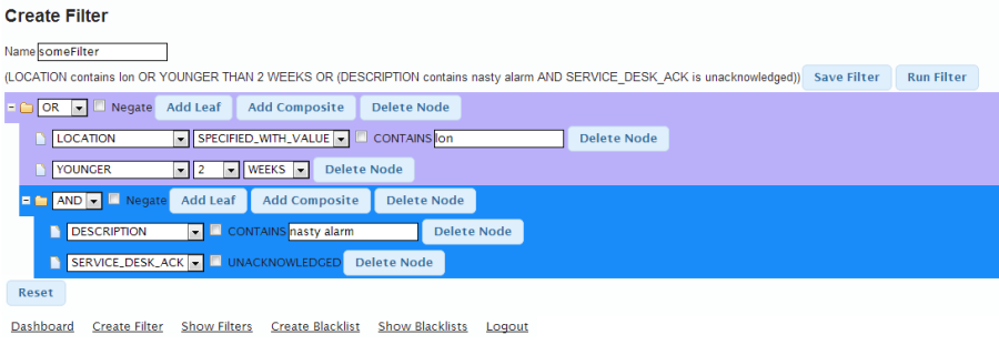
Figure 55 Nested Conditional Group
Now we have a nested conditional group: an AND within an OR. The alarm will now be caught if either:
- One of its locations contains "lon"
- It is younger than 2 weeks
- Its description contains "nasty alarm" AND it has not been acknowledged by the service desk
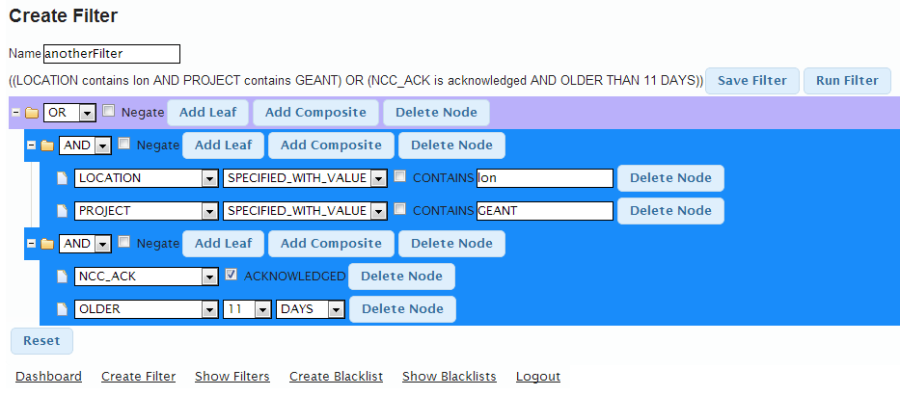
If we needed to for some reason, we could create a group within the subgroup:
Figure 56 Doubly nested conditional group
The filter groups can be nested to different depths, to create filters of varying complexity. You can also have multiple groups at the top level*, instead of nesting:
Figure 57 multiple top-level groups
[*Strictly the two AND groups are at the level below top, since they are linked by a top-level OR group].
Adding a new Filter Group
To add a new group, simply click on the "Add Composite" button of the node to which you want to add the child group.
Filter Text Update
At the top of the page is an uneditable filter text string:
Figure 58 Filter Text
This is automatically updated whenever any change is made to the filter form below; any change in the form will be reflected in the filter text.
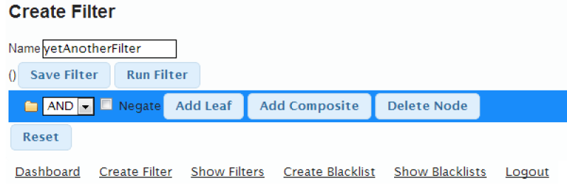
When a new filter is created, it starts out looking like this:
Figure 59 Initial Filter Form
At this point the filter text is blank, as we have not populated the filter:
Figure 60 Blank Filter Text
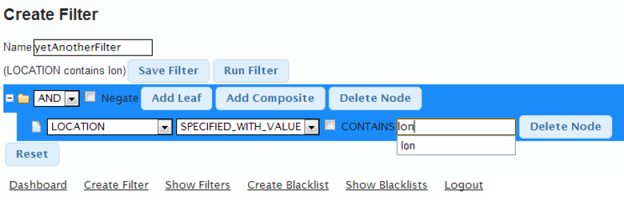
If I want to add an individual filter, I click "Add Leaf":
Figure 61 Filter Form with Leaf
Now the Filter Text has been populated automatically to reflect the new node:
Figure 62 Populated Filter Text
If we then start to type in the text field, it will update the filter text almost immediately (the delay is deliberate to make the text update as slick as possible):
Figure 63 Filter text updated with text input
Smart Dynamic Components
The components present in an individual filter row are interdependent: a text field, for example, would not make much sense if you were looking to filter by either acknowledged or unacknowledged. The tree will therefore update as appropriate whenever you change the value of one of its fields.
This is most noticeable when altering the value of the filter criterion (eg. location, description, ncc_ack, older etc). Compare these, for example:
However, it can apply when altering other components. Here we alter the "specified" dropdown:
(LOCATION is present)
(LOCATION is absent)
And here the "contains" checkbox:
In each case, the filter text at the top will also be updated accordingly.
Running or Saving a Filter
When the user has finished creating the filter, it can be run or saved by pressing the appropriate button next to the filter string.
Editing a Filter
As mentioned earlier, you can edit a filter both before and after it has been saved.
If you are in the process of creating a filter, and you decide to run it or return to a different view, the filter tree will be cached so you can return to it in the state you left it by simply going to the "Create Filter" page.
If you want to edit a pre-saved filter:
- go to the "Show Filters" page, which will show you a list of all filters in the database
- click the "Edit" button of the filter you want to edit
Creating Blacklists
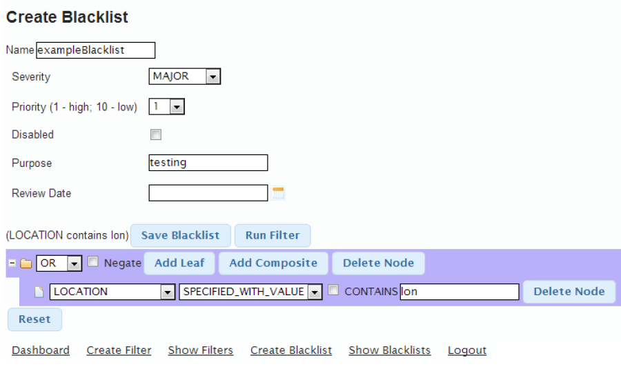
The Create Blacklist view contains a tree just like that in Create Filter, plus a series of components to set blacklist metadata. These include:
- Severity
- Priority (the lower the number, the higher the priority)
- Whether or not the blacklist is disabled/enabled
- Purpose
- Review Date (which brings up a calendar when edited)
Figure 64 Create Blacklist View
There are options above the tree to either:
- Save the blacklist or
- Run it as a filter
The second option gives the user the chance to see which alarms would be caught by the blacklist before saving it. If the results differ from expectations, the blacklist can be edited before saving by navigating again to the "Create Blacklist" page, where the blacklist tree will be in the same state as it was before the filter was run.
h1.Managing Filters
To manage existing filters, go to the "Show Filters" page through either the navigation bar, the main menu or the context menu.
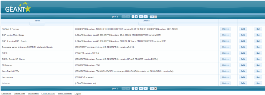
The Show Filters page looks as follows:
Figure 65 Show Filters
The display is fully paginated (with configurable rows per page), and provides the following functionality:
- Filtering on either name or filter criteria
- Delete a filter
- Run a filter
- Edit a filter
Filtering Filters
The name and criteria columns both provide the option to filter results (like the "Show Origins" page):
Figure 66 Filtering by filter name
Simply type into the text field to filter the content of the table. In both cases:
- the filter will look for the letters you type anywhere in the column value
- it will filter on the entire set of saved filters, not just the ones you see on the current page
Deleting Filters
Click the relevant "Delete" button to delete a filter.
Running a Filter
Click the relevant "Run" button to run a filter.
The resultant filtered alarms table will display the current filter text in the top-left:
Figure 67 Filter Text When Running Standard Filter
Editing a Filter
Click the relevant "Edit" button to edit an existing filter, this will take you to the edit filter page and automatically populate the filter tree:
Figure 68 Editing a loaded filter
h1.Managing Blacklists
Managing Blacklists is very like managing filters (above), with a few extras.
To manage blacklists, navigate to the "Show Blacklists" page through the navigation bar, main menu or context menu:
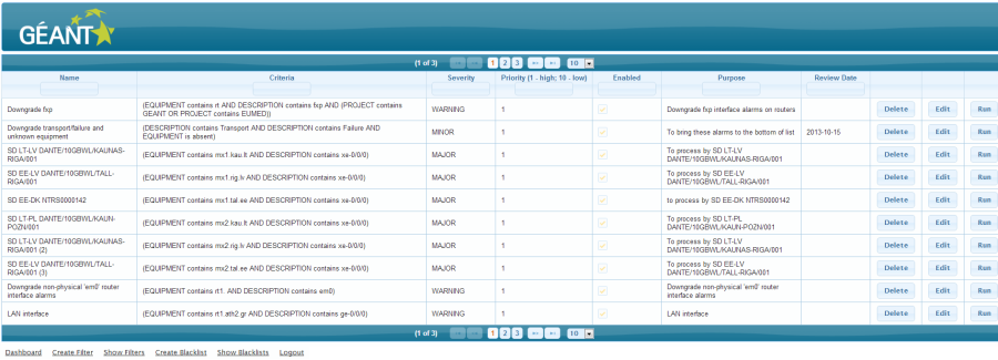
Figure 69 Show Blacklists page
There are many more columns in the Show Blacklists view than Show Filters,since blacklists have various metadata fields which filters lack.
As with the Show Filters page, the user has the option to delete, edit or run (as a filter) an existing blacklist.
He/she can also filter by most of the columns in the blacklist table (see Show Filters or Show Origins section above for details on how to do this). The table is also paginated and has configurable rows per page.
Logging In and Out
Log In
To log in to an instance of the new Dashboard, go to the following url:
{IP_OR_NAME_OF_HOST_MACHINE}/dashboardV2
This will redirect you to the Login page, where you can enter your name and password (and enable remember me if desired).
Log Out
To log out of the new Dashboard, use either the "Logout" link on the bottom navigation bar or the link of the same name in the right-click context menu.
h1.Theme Gallery
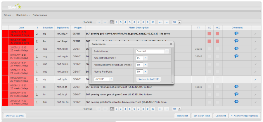
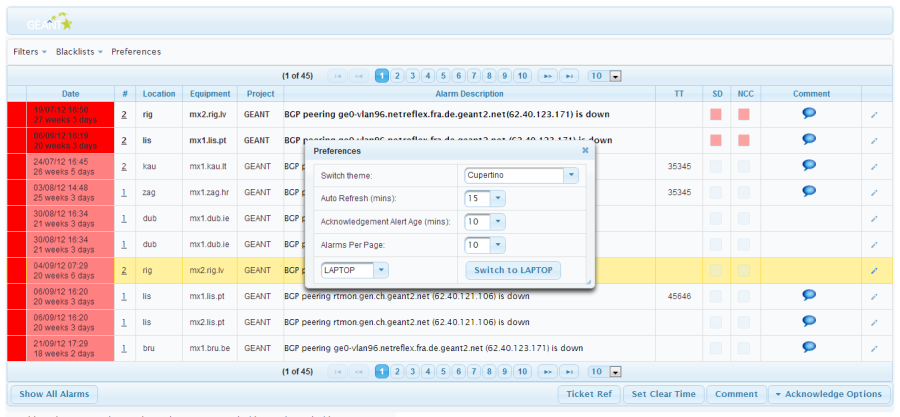
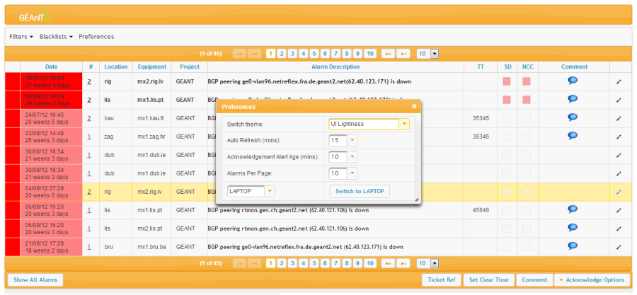
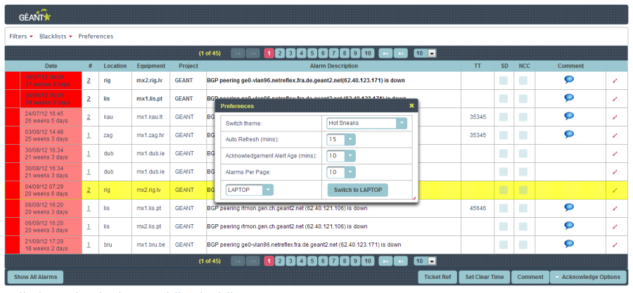
All themes are shown in Laptop view.
Figure 70: Sunny
Figure 71 Smoothness
Figure 72 Humanity
Figure 73 Start
Figure 74 Overcast
Figure 75 Cupertino
Figure 76 UI Lightness
Figure 77 Hot Sneaks
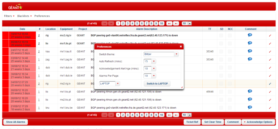
Figure 78 Blitzer
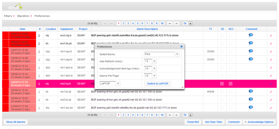
Figure 79 Flick
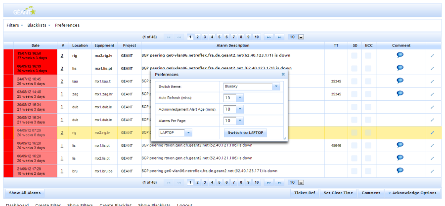
Figure 80 Bluesky
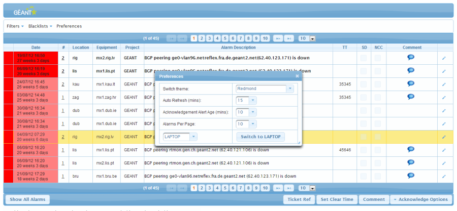
Figure 81 Redmond
